
rakuten-viki
Role: User Experience Designer · User Interface Designer
Tools: Figma
Timeline: November 2025 - December 2025
Purpose
This project explores how subtle but intentional UX and UI enhancements can transform an existing streaming platform into a more emotionally resonant experience for its core audience. Rather than redesigning Rakuten Viki from the ground up, I worked within the platform's existing structure to amplify its K-drama identity through visual hierarchy, content organization, and interaction design.
Observing Rakuten Viki
Rakuten Viki is a global streaming platform for Asian dramas, yet its home page experience does not fully reflect the emotional tone, storytelling intensity, and genre expectations that K-drama viewers specifically seek. The interface feels platform-generic, making it harder for users to immediately immerse themselves in the K-drama experience or discover content in a way that feels intentional and emotionally engaging.
Design Challenge
How might we enhance Rakuten Viki's existing home page to better align with K-drama viewers' expectations without reinventing the platform?
THINGS TO CONSIDER
- → Contextual immersion
- → Expectation matching
- → Emotional UX
AUDIENCE
- → People interested in Asian dramas
- → Asians of all ages
- → Majority western audience who doesn't have access to different kinds of dramas
CONTENT
- Kdramas • Cdramas • Thai Dramas • etc.
Design Direction
Color Palette
I retained Rakuten Viki's primary color palette to preserve brand consistency and user familiarity. This allowed the redesign to focus on enhancing the experience and emotional tone of the platform rather than introducing a new visual identity.
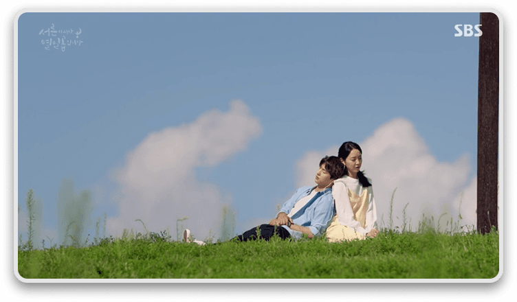
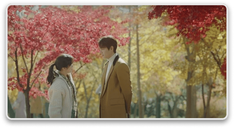
Thirty But Seventeen
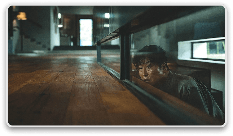
Parasite
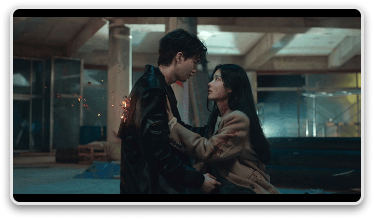
My Demon
The King: Eternal Monarch
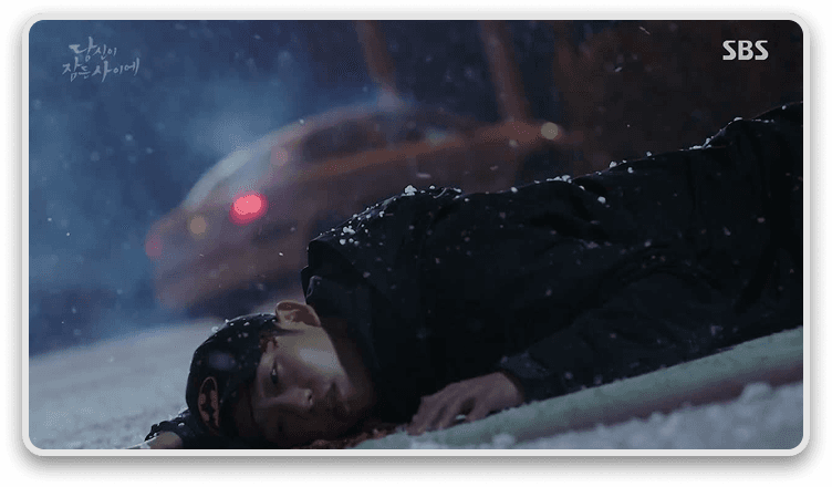
While You Were Sleeping
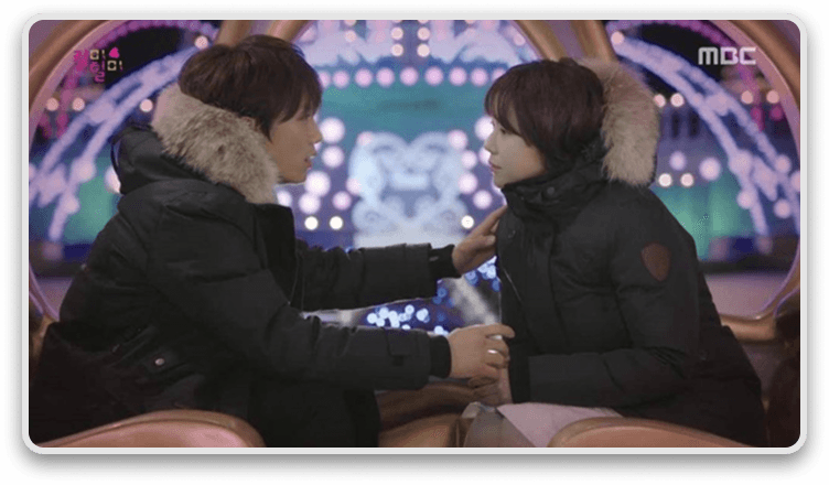
Kill Me, Heal Me
Cinematography
Asian dramas often emphasize visual storytelling through cinematography, including the use of camera angles, color grading (LUTs), filters, and the rule of thirds. I drew inspiration from these visual principles and translated them into the Rakuten Viki user experience by applying similar compositional structure to layout.
Rakuten Viki
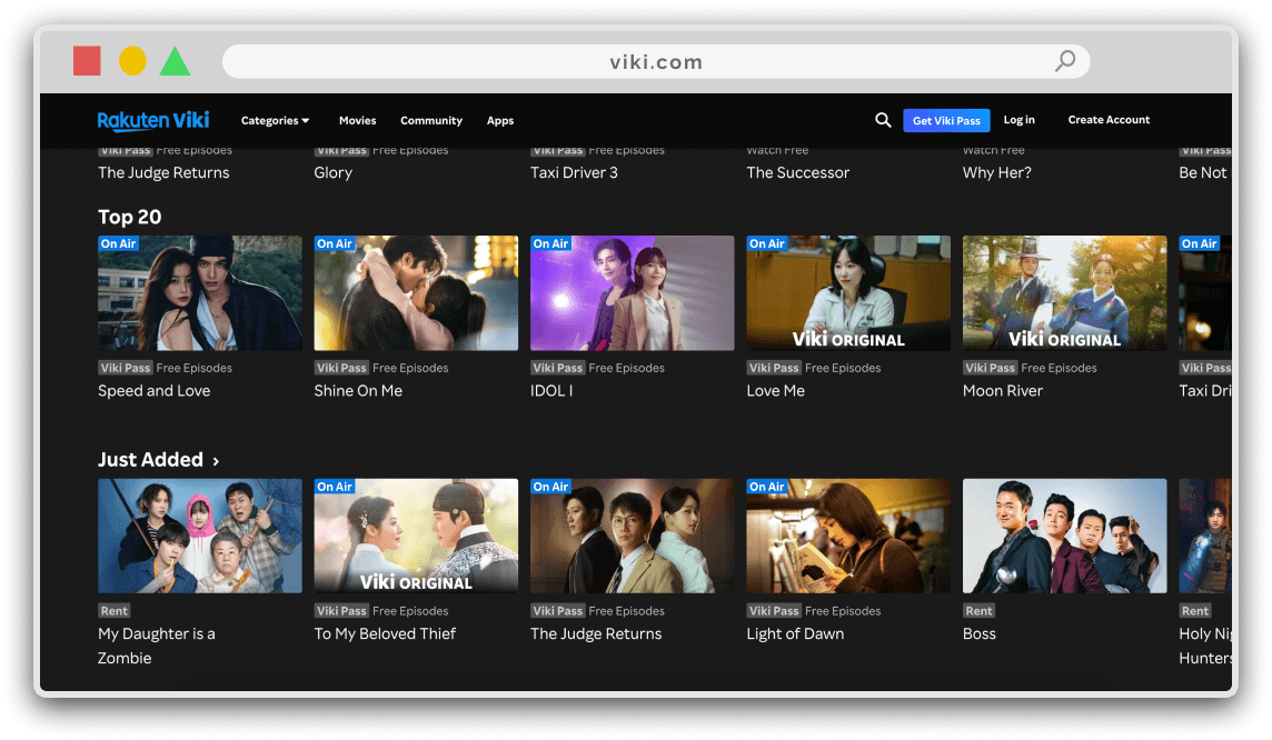
Content Discovery → category-heavy, community-driven
Visual Tone → functional but underutilizes cinematic framing
Target Emotional State → emotionally invested fandom
Mubi
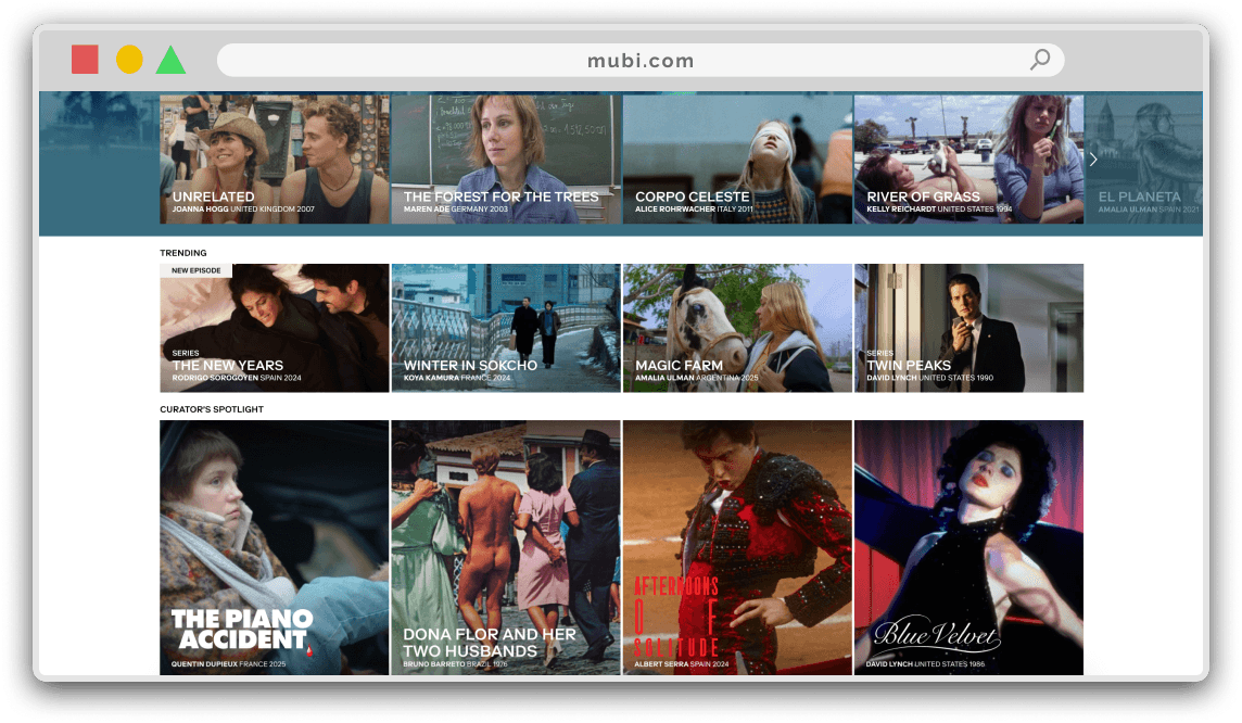
Content Discovery → editorial, slow, intentional
Visual Tone → film-poster composition, negative space
Target Emotional State → mindful, curated viewing
Netflix
Content Discovery → algorithmic, infinite scroll, personalized
Visual Tone → neutral, scalable UI
Target Emotional State → passive binge consumption
Competitor Analysis
To better understand how streaming platforms support different viewing intentions, I analyzed Rakuten Viki alongside Netflix, and MUBI. Each platform represents a distinct approach to content discovery, visual tone, and emotional engagement which helped inform my design direction for Viki's home experience.
Initial Design Sketches
Based on the design direction, my initial approach prioritized users' existing mental models of streaming platforms. Familiar interaction patterns, such as Netflix's infinite vertical scroll and horizontally scrolling content rows, were incorporated to maintain navigational familiarity and reduce confusion.
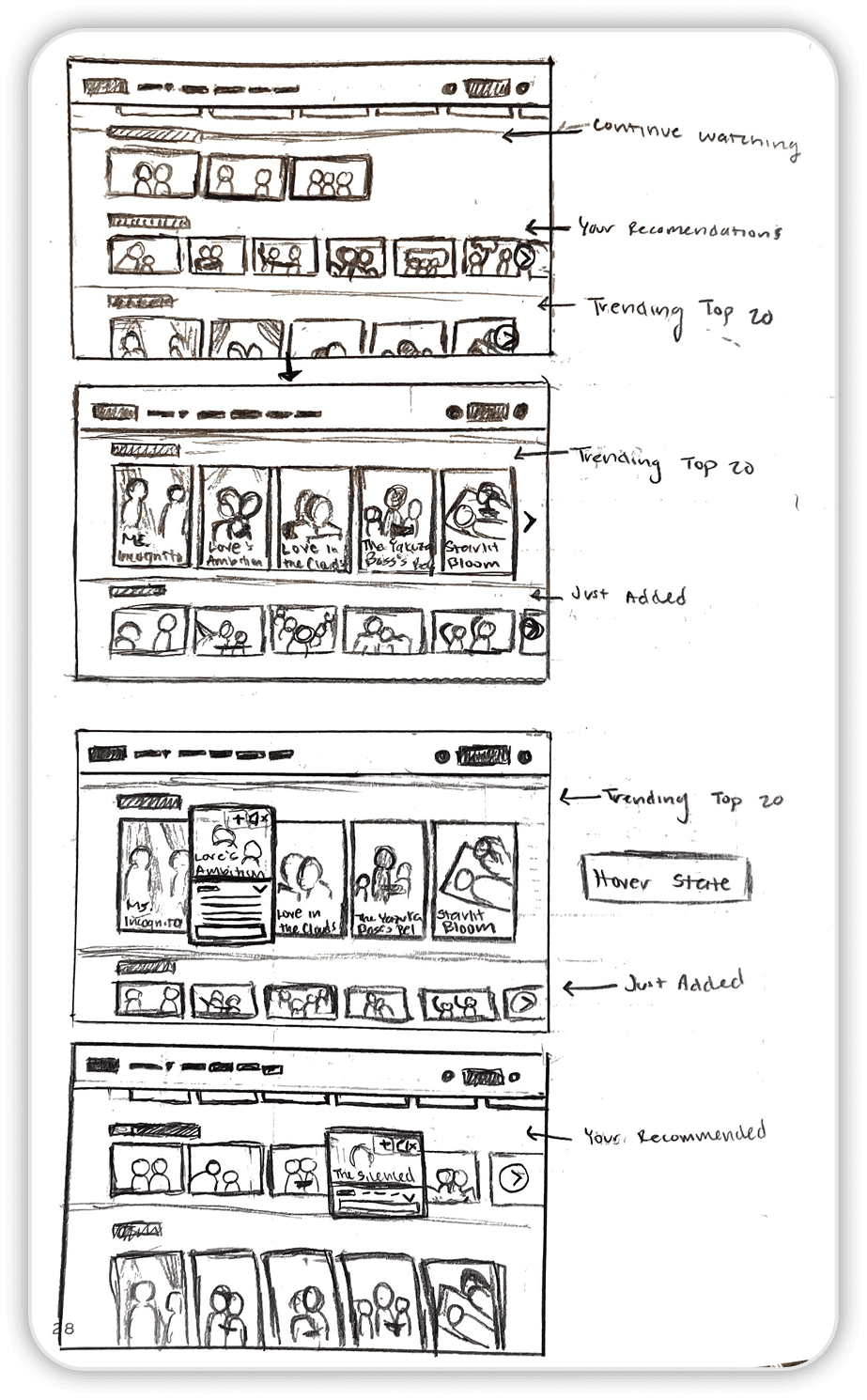
Used MUBI's use of intentional negative and positive space to defeat visual repetitiveness with full-width banners as visual pauses, helping segment content and create moments of focus within the browsing experience
Hover state of vertical vs. horizontal cards
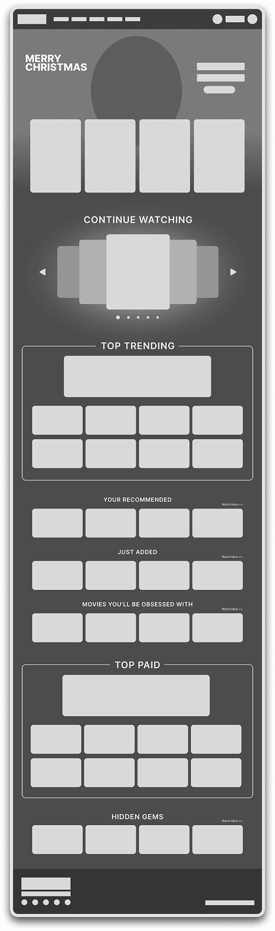
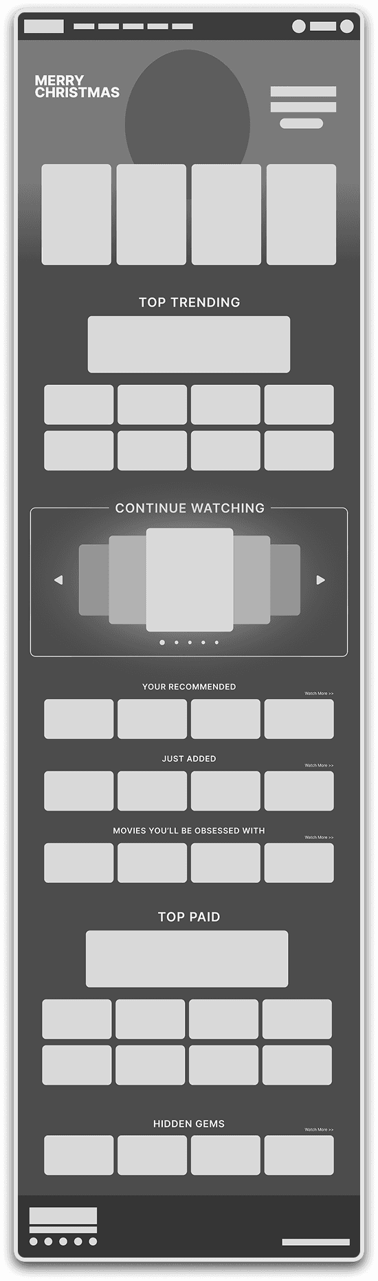
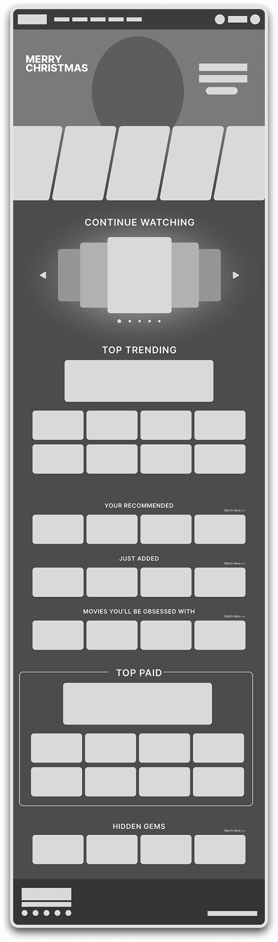
Reinvented Viki's "Seasonal Collection" section from a simple row into a full-width banner inspired by MUBI to segment content and create curated focus for interested users
Hover state of vertical vs. horizontal cards
Hover state of vertical vs. horizontal cards
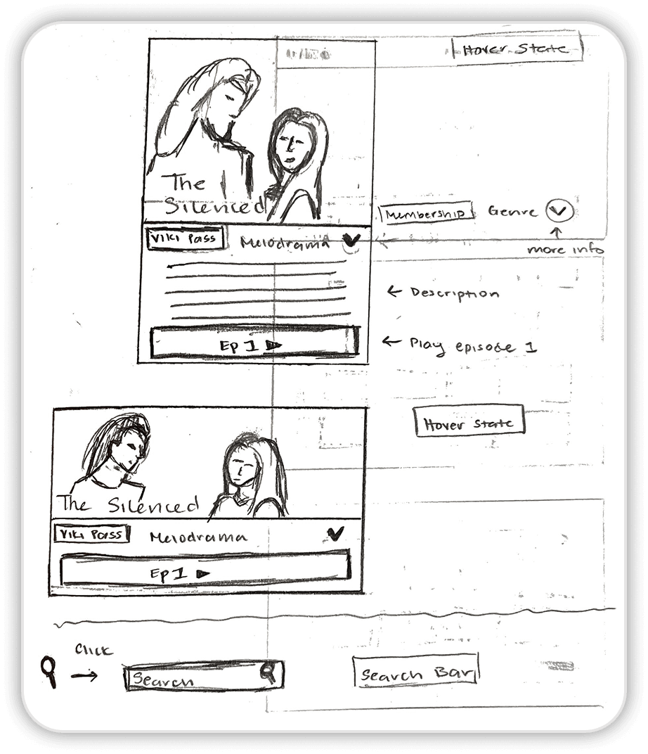
Close-up hover state of vertical card
Close-up hover state of horizontal card
Hover state of search bar
Feedback - Bringing Out The Essence of K-Drama
A key insight from a round of feedback was that my early design relied too much on familiar streaming patterns, which made it feel generic. I was encouraged to pivot, shifting the focus from competing platforms to Viki Rakuten itself, and to design more intentionally around the emotional and stylistic essence of K-dramas to differentiate Viki.
So what makes K-Drama aesthetically beautiful?
While beauty is often considered subjective, in design it emerges at the intersection of aesthetics and function. Prompted to reconsider the meaning of beauty, I concluded that beauty is judged through proportions, composition ratios, color combinations, or self-expression.
In K-dramas, beauty is intentionally constructed through cinematic choices from the director's framing and composition to filming locations and costume design. Drawing from this visual language, my design adopts a center-aligned layout to mirror the balanced framing commonly seen in K-drama cinematography. Center alignment creates a sense of focus, symmetry, and visual intention that creates a composed and aesthetically cohesive browsing experience.
Designs Based On Feedback
Once the sketch was refined, I digitized the concept and developed five iterations for A/B testing. Evaluating the designs at different levels of engagement, both as a zoomed-out overview and through scroll-based interaction, revealed that visual preference shifted as users became more immersed in the experience.
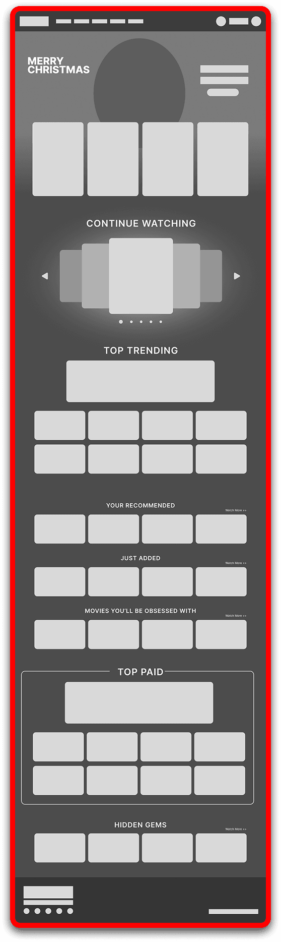
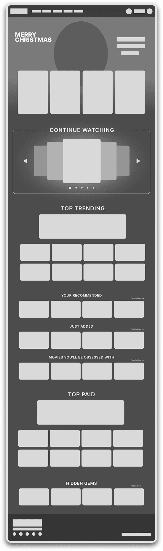
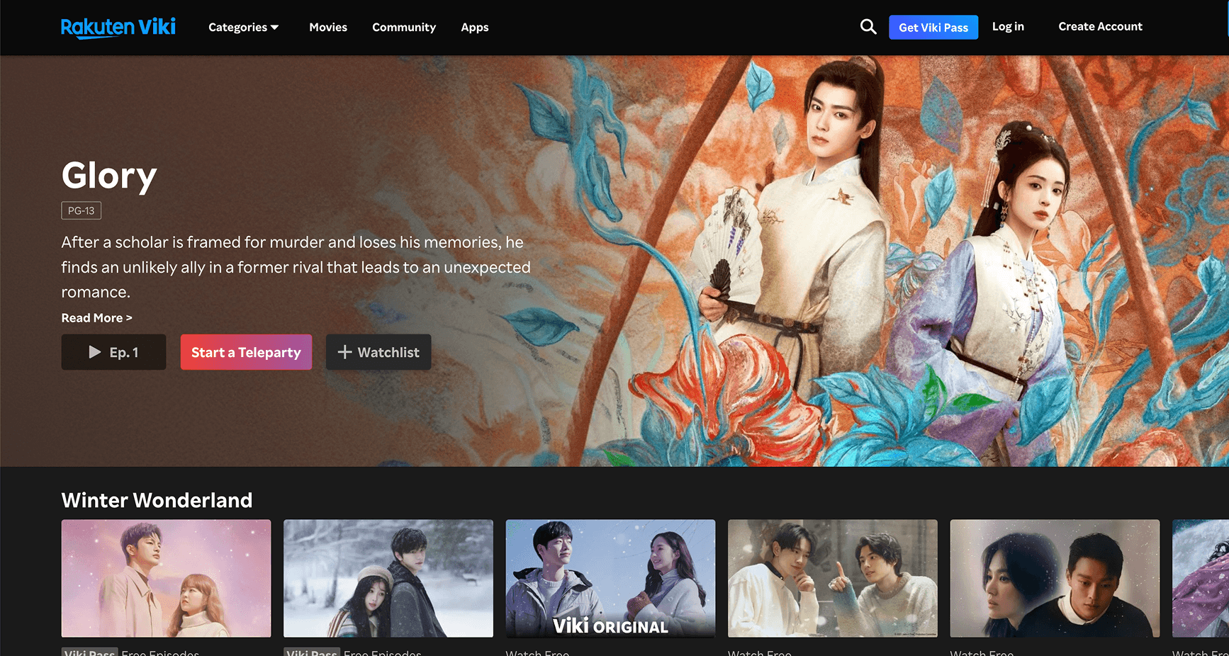
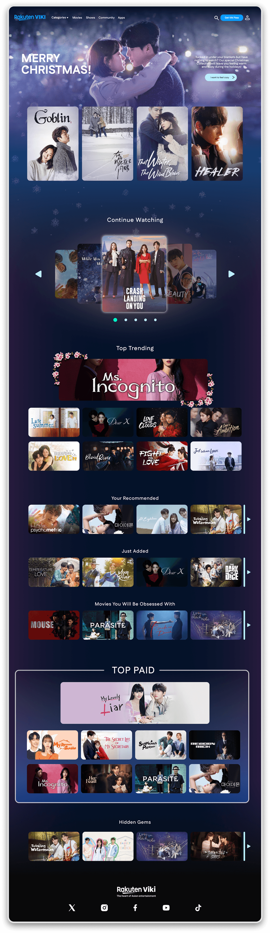
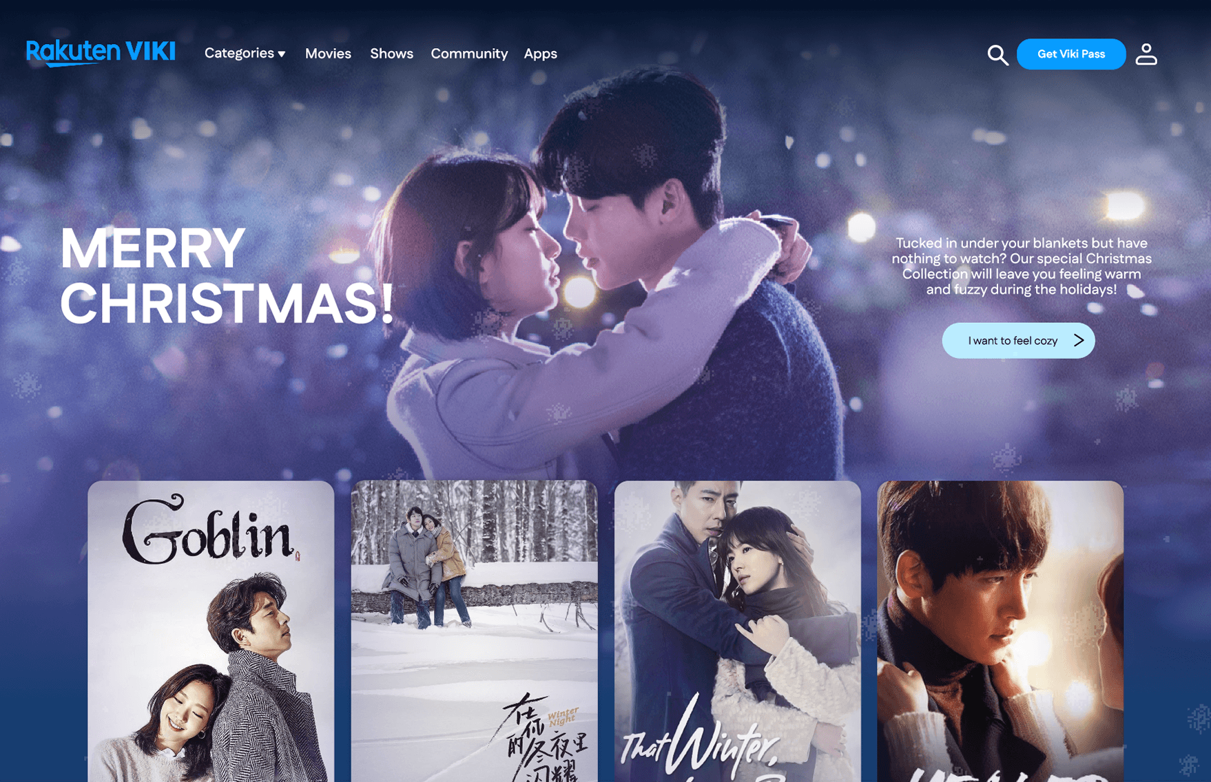
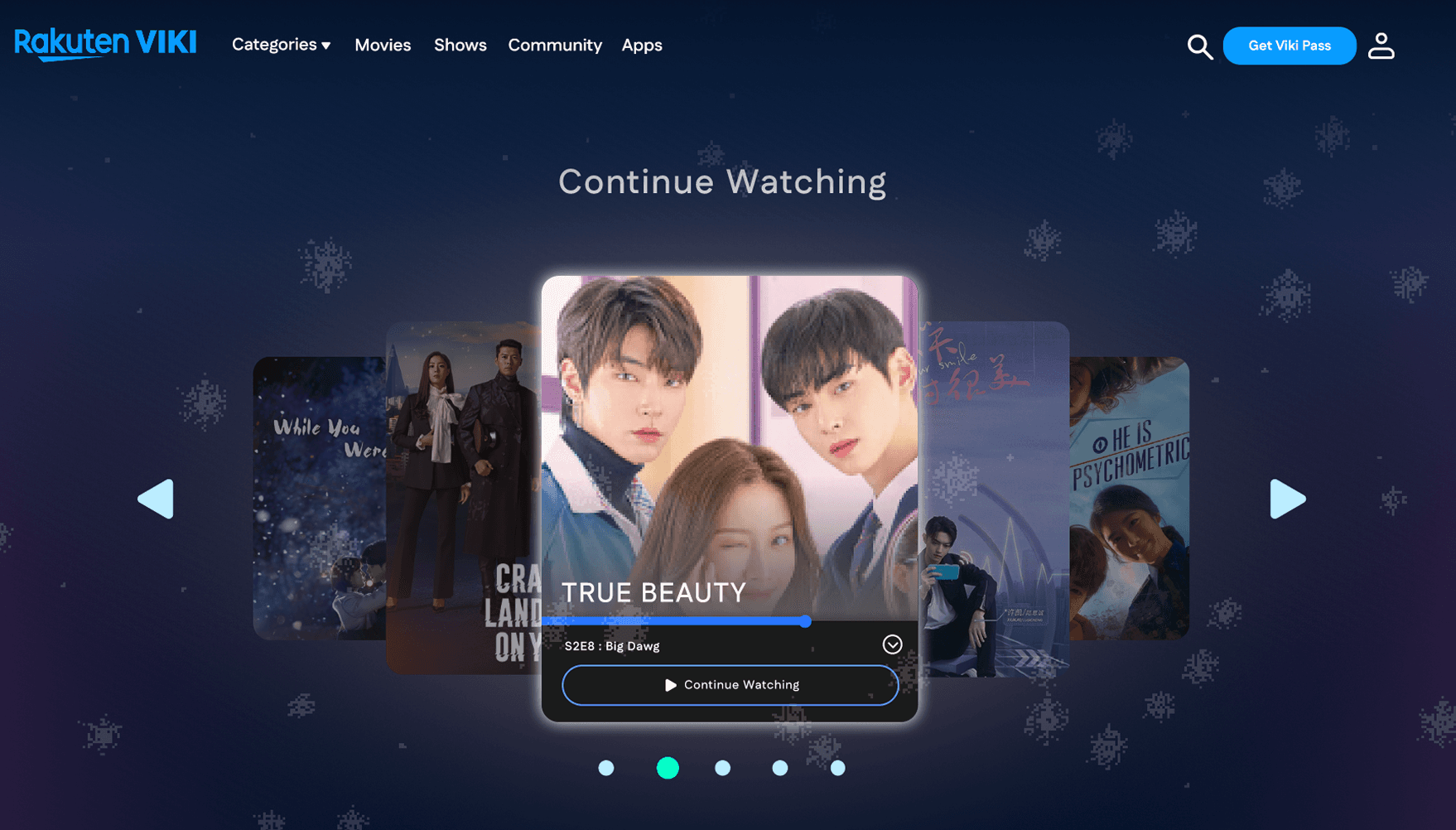
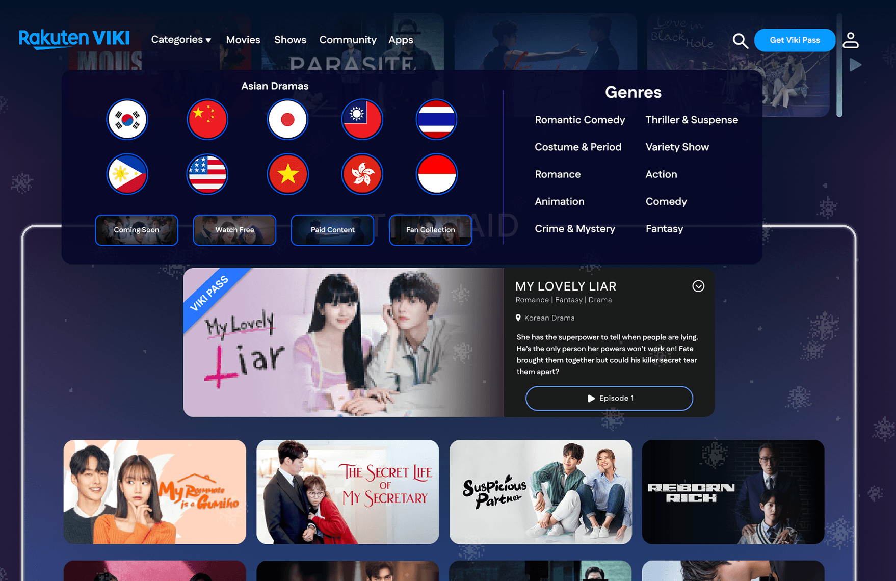
Final Product
The final product reflects a refined home experience for Rakuten Viki that balances familiarity with intentional cinematic design. Center-aligned compositions, full-width banners, and curated sections work together to echo the framing and pacing commonly found in K-dramas. The final design enhances Viki's existing identity, allowing users to browse content in a way that feels visually composed, emotionally engaging, and aligned with the essence of K-drama storytelling.
Reflection
This project challenged me to rethink what “good design” means beyond familiarity. While my initial approach leaned on established streaming patterns, feedback I received pushed me to look inward at the platform's identity and the emotional language of K-dramas themselves. Through iteration, I learned how intentional composition, spacing, and visual rhythm can shape immersion just as much as functionality. This experience reinforced the importance of designing not only for usability, but for feeling and recognizing that the most effective experiences are those that align interface decisions with the story a product is trying to tell.